Filed under: History 615
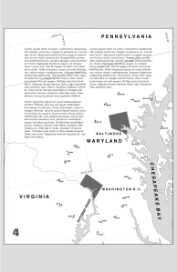
Alright so here is what I have as of tonight for a ROUGH draft of my final project. As you can see all of the text is Lorem Ipsum as my main focus this week was in getting my maps at least almost done (they still need some work) and getting a layout set. I’m pretty happy with the way it’s turned out so far…as in I think it at least somewhat resembles something you would find in an atlas.. I’ll comment further probably tomorrow afternoon before class as I should have some free time. For right now though I’d just like to get these up. You can view each page by either clicking on the link to open up the PDF or just click on the image to open up a larger one in a new window.
And yes…it is Black and White…and yes…I made it that way on purpose. So for all you B&W haters out there you’re just going to have to deal.
8 Comments so far
Leave a comment


I think your layout and graphics are excellent! I think the black & white works great for this piece. Gives a nice 50s 60s look resonant with the Cold War theme. Page 2 PDF would not display for me. Just loads a black browser window. Might be the size of the file at 4MB. Looked fine after downloading the PDF with “Save link” function. JPEG image is OK though. Looking forward to seeing it in print.
Comment by reskelsen December 2, 2010 @ 6:47 amYour layout looks great. I like the black and white too! I really like how you used the large maps as the backgrounds as well as an important part of illustrating what I assume will be your thesis.
Comment by carawhiting December 2, 2010 @ 3:51 pmI very much like how you incorporated the maps and the text together on pages 4 and 5. I too think the b&w work well, and indeed gives it that Cold War aesthetic.
It seems as though getting the layout creates a flow all its own. I imagine the essay will fit nicely into the order you’ve put forth. Do you foresee any drastic changes once you put the essay in the text boxes, or will the narrative flow the way the maps are now?
Comment by rosendof December 2, 2010 @ 3:55 pmThanks for the comments Rosendo. I don’t really foresee any MAJOR changes to the layout at this point, but that really is going to depend on how much text space I can manage to fill up. If anything I think what may end up happening is I drop one page and and what is now page 3 might become page 5. The narrative should flow for the most part the way it is now. Start off with some overview and go into talking about DC, then Chicago, the try to wrap things ups…
Comment by rkpalmerjr December 2, 2010 @ 5:13 pm[…] week I commented on Alisa’s, Ruel’s, Kevin’s, and Dan’s […]
Pingback by Comments « History and Cartography December 2, 2010 @ 3:56 pm[…] commented on Kevin‘s rough draft . This entry was posted in comments. Bookmark the permalink. ← […]
Pingback by comments | Cara Whiting's Blog December 2, 2010 @ 4:00 pmThis looks great. Pages 2, 4, and 5 are particularly appealing with the way you superimposed your text onto the maps and used them as both visuals within your arguement and as the background. I will most certianly be finding out how you did that in class tonight!
Comment by mbestebr December 2, 2010 @ 5:27 pm[…] Black and white theme is excellent in Kevin’s Cold War piece on the Nike Missiles. […]
Pingback by HIST615 Comments 12/02/2010 « Ruel J. Eskelsen's Digital History Blog December 2, 2010 @ 7:09 pm